
During the Covid-19 global outbreak, the visual communicating of data has been a vital tool for governing leaders, health professionals, and news reporters alike. Whether you have been following developments on TV, on the web, via social media, or maybe through traditional print media, you cannot fail to have encountered the plethora of charts and graphics used to explain developments about this crisis.
The challenge of effectively informing diverse populations cannot be underestimated. You are attempting to reach broad audiences with extreme variations in levels of subject knowledge and data literacy. You have audiences who are receptive to being informed and others who do not share the same motivation. The data can be uncertain, and it can be technical, with nuances in how quantities and categories are shaped. There are unknowns about predicting what may come next, how different scenarios may play out, and explaining how – or if – it will all end. There are myriad things you could say about the subject, so what will you say? All that comes before you get into the design intricacies of how you will present it.
Data visualisation is hard to do well. This is not because it is especially complicated, rather more because of the complexities that come with it. There are lots of small decisions for which the available options are often broad and the choices you make are rarely objective. Each decision has a consequence on shaping the next decision.
It is perhaps unsurprising that competence in data visualisation is gaining ever more recognition as an essential capability. Just as computer literacy is seen as a necessity, expected of everyone to be able to fully participate in the modern workplace, in education, and in society, the demand for literacy in communicating with data follows a similar, if belated, trajectory.
However, knowing you need to embrace the potential of data visualisation is one thing, knowing what that entails is quite another matter.
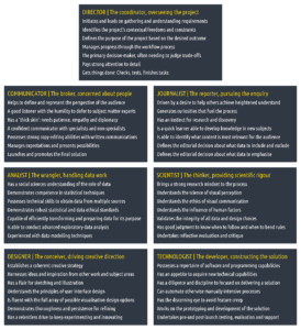
The Seven Hats of Data Visualisation
In this article I propose a framework that profiles the range of different ingredients that form a recipe of expertise in data visualisation.
Inspired by Edward de Bono’s Six Thinking Hats, the ‘Seven Hats of Data Visualisation’ is a breakdown of different aptitudes, blending together elements of knowledge, skills, behaviours, and habits. This framework has been shaped from over a decade studying and practicing my own visualisation skills alongside a similar period attempting to educate others through teaching and book-writing.
The seven hats framework presents an ideal tariff of complete literacy which may not be attainable, such are the interdisciplinary demands. On one level, the framework can operate as a checklist of individual capabilities required. On another it can be seen as the repertoire of multidisciplinary capabilities held across a team or department.
Not all ingredients are of equal weighting and will not always be relevant to every task or project worked on. However, it should at least offer useful guidance on the potential set of aptitudes one should aspire to attain or demonstrate:
Assessing Your Capabilities
The motivation for constructing this framework was to dispel this subject as being reserved for experienced specialists alone. It was to highlight the non-technical and non-specialist requirements that we can all demonstrate. We can all pay stronger attention to detail. We can all take care to listen to other peoples’ inputs. We can all generate curiosities about topics. We can all judge if the layout of our work makes sense to us.
For beginners, starting a journey learning data visualisation can be overwhelming – ‘where to begin!?’ – and, for some, intimidating – ‘how will I ever achieve something of that quality!?’. You have to start somewhere and that should always commence with recognising and harnessing the existing strengths you will have.
We all come from different origins – artists, developers, statisticians, journalists, academics. Regardless of your background or previous experience, everyone has something to contribute to data visualisation. A trained or natural talent in fields like graphic design, computer science, or journalism is inevitably advantageous, but the more important starting point is to recognise that data visualisation is fundamentally human-centred. Data is about people or phenomena that affect people. Visualisations are generated by people and are for people.
Developing mastery across the full collection of attributes is probably unachievable – I can maybe list fewer than ten people I’ve encountered who genuinely have – but it offers a guide to help assess your current levels of competence and a wish list for development in those where you recognise shortcomings. The people who flourish in this field are able to recognise their strengths, their weaknesses and are motivated to learn.
I am painfully aware of the things I am simply not good enough at (programming), the things I have no direct education in (graphic design) and the things I do not enjoy (finishing, proofreading, note-taking). I know what I am capable of doing better and what I am not capable of at all. It has taken time, but I know what my level is and where my boundaries lie.
But what about you? Now you have become acquainted with the contents of the framework, read it back through, in detail, but this time consider how you measure up to each element:
Which capabilities do you strongly demonstrate? [5 points]
Which capabilities do you adequately demonstrate? [3]
Which capabilities do you not adequately demonstrate but you know you could? [1]
Which capabilities do you not adequately demonstrate, and you never will? [0]
Developing Your Capabilities
For those hats, in general, and ingredients, specifically, where you have identified a shortcoming, what can be done to address these? There are many learning activities and development strategies we can consider.
Collaborating with others. There are advantages to pursuing data visualisation solutions collaboratively, bringing together different abilities and perspectives to a shared challenge.
The best functioning visualisation team will offer a collective blend of competencies across all seven hats. Crucially, when setting up a team, it is important to avoid skewing the sensibilities towards one dominant talent. Success will be hard to achieve if a team comprises a dominance in technologists or a concentration of ‘ideas’ people whose work never progresses past the sketchbook. You need the right blend in any team.
In workplaces across industries and sectors, as the field matures and becomes more embedded, I have witnessed a shift towards small, multidisciplinary teams to fulfil data visualisation projects collectively.
In larger news organisations that have the luxury of (relatively) large graphics departments, team working is an essential ingredient behind much of the success they have had. Producing relentlessly high-quality, innovative and multiple projects in parallel, within the demands of the news environment, is no mean feat. Such organisations might have the most people and also some of the best people, but their output is still representative of their punching above their weight, no matter how considerable that base.
Compromise is often essential. Almost every project I undertake will involve an eventual trade-off between heightened initial ambitions and the practical realities. As I mention above, I don’t have advanced programming skills. For those projects where I can’t supplement my abilities with collaborators who bring additional skills, a compromise solution may be necessary. Recognising your limits is a key part of mobilising your abilities.
Practice, practice, practice. The journey from good to great, as with anything, involves hard work, plenty of learning, lots of mistakes, but, most importantly, a relentless appetite to gain experience. Identify personal projects what will allow you to experiment with and explore different techniques and face up to resolving different challenges. Learn reflectively about your abilities by taking notes about your thought-processes, your ideas and the rationale for your decisions.
Self-directed learning. The life and energy of data visualisation is online, so keep on top of blogs, the websites of major news media, studios, and creative agencies producing great work. Consume case studies, process narratives, and constantly challenge your design ‘eye’ by evaluating the work of others (‘what would I do differently?’). On social media (especially Twitter) you will find an active and welcoming community of practitioners that is always willing to share and help. Listen to podcasts and register for webinars to immerse yourself in contemporary topics and latest discourse.
Network. Attend conferences and local meetups to inform and enlighten yourself with the contents presented but also exploit the wonderful opportunities for building your network with meeting the community of contributors and enthusiasts, in person.
Look beyond. Expose yourself to the ideas and practices of other related creative and communication fields such as video game design, graphic design, architecture, and even activity cartoon illustration.
Work outcomes. Sometimes the effectiveness of your visualisation work is tangible, but most times it is entirely intangible. If the purpose of the work is to further the debate about a subject, to establish one’s reputation or voice of authority, then those are hard things to pin down in terms of an outcome. One option may be to flip the measure of effectiveness on its head and seek out evidence of tangible ineffectiveness. For example, there may be significant reputation-based impacts should decisions be made on inaccurate, misle6ading or inaccessible visual information.
There are, of course, some relatively free quantitative measures that are available for digital projects, including web-based measures such as visitor counts and social media metrics (likes, retweets, mentions). These, at least, provide a surface indicator of success in terms of the project’s apparent appeal and spread. Ideally, however, you should aspire also to collect more reliable qualitative and value-added feedback, even if this can, at times, be rather expensive to secure.
Some options include:
⦁ capturing anecdotal evidence from comments submitted on a site, opinions attributed to tweets or other social media descriptors, feedback shared in emails or in person;
⦁ informal feedback through polls or short surveys;
⦁ formal case studies which might offer more structured interviews and observations about documented effects;
⦁ experiments with controlled tasks/conditions and tracked performance measures.
Evaluating your performance: A personal reflection or assessment of your contribution to a project is important for your own development. The best way to learn is by considering the things you enjoyed and/or did well (and doing more of those things) and identifying the things you did not enjoy/do well (and doing less of those things or doing them better). Look back over each project experience and consider the following:
⦁ Were you satisfied with your solution? If yes, why; if no, why and what would you do differently?
⦁ In a different context, what other design solutions might you have considered?
⦁ Were there any skill or knowledge shortcomings that restricted your process and/or solution?
⦁ Are there aspects of this project that you might seek to recycle or reproduce in other projects? For instance, ideas that did not make the final cut but could be given new life in other challenges?
⦁ How well did you utilise your time? Were there any activities on which you feel you spent too much time?
Developing expertise in data visualisation will take time. It will require your ongoing efforts to learn, apply, reflect and repeat again. I am still learning new things every day. It is a journey that never stops because data visualisation is a subject that has no ending.